Responsive Navigation Extension for Contao
The Responsive Navigation extends Contaos responsive design by switching the navigation menu into a mobile menu design with expandable menu items on small displays.
- Using only CSS and JavaScript/jQuery.
- No extra module in layout necessary.
- No duplicate menu in HTML code.
- Full designable.
Usage
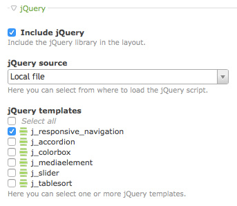
- Enable jQuery and add j_responsive_navigation template to your layout.
- Set CSS id
mainmenuto your navigation module. - Style your responsive mobile menu.
Theme
The following code shows a snippet of a menu.
<nav class="mod_navigation block" id="mainmenu">
<div id="mainmenu-icon">☰</div>
<a href="#skipNavigation109" class="invisible">Skip navigation</a>
<ul class="level_1">
<li>[...]</li>
</ul>
<a id="skipNavigation109" class="invisible"> </a>
</nav>
The supplied CSS hides the mobile menu icon #mainmenu-icon on desktop and hide
the menu #mainmenu > ul on mobile devices. The supplied JavaScript toggle the
menu #mainmenu > ul on mobile devices.